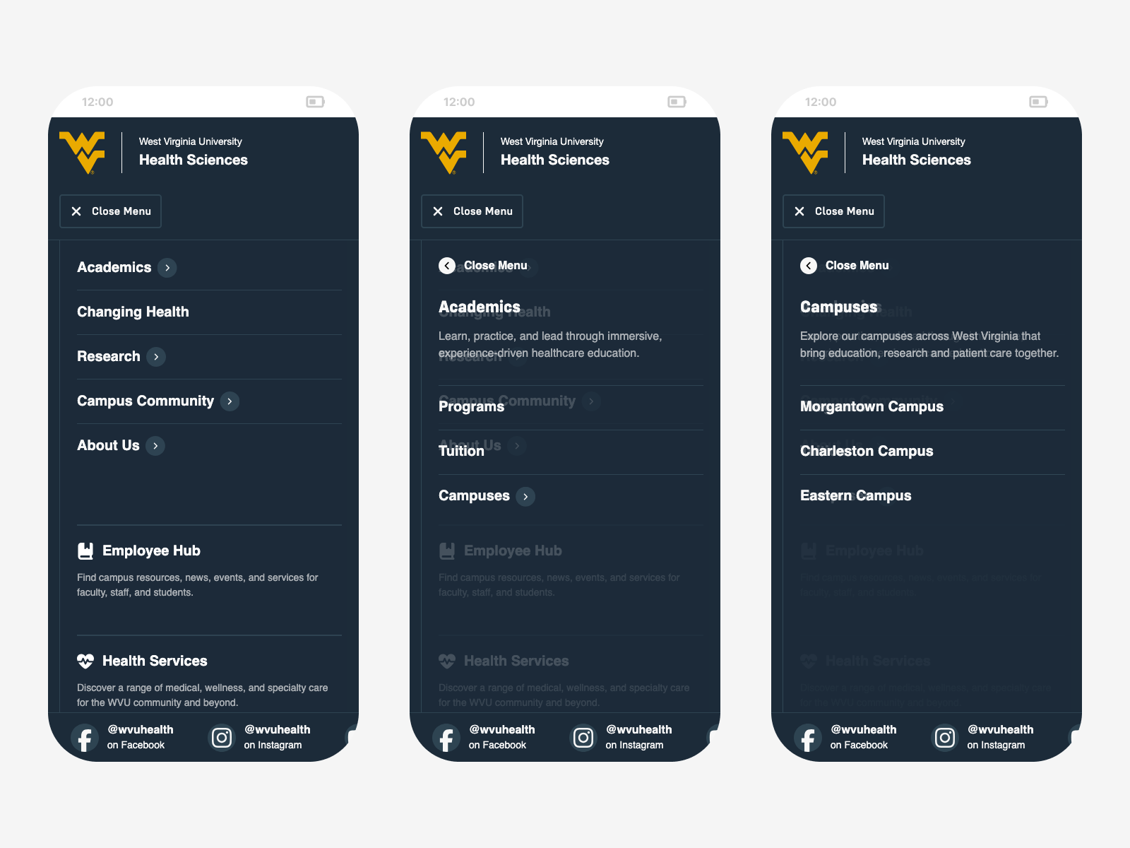
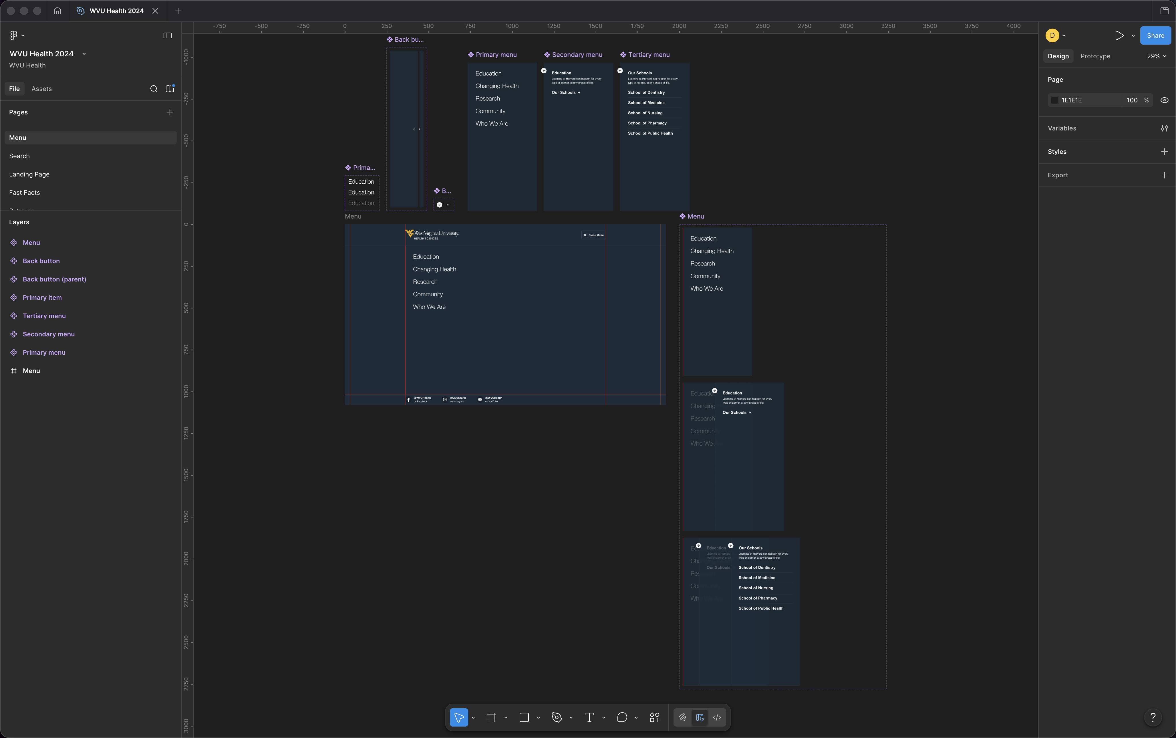
Menu Overlay
Strategy & UX
Designing for multiple audiences above the fold is a losing proposition. Prioritize one group and you compromise the others. Try to serve everyone and you serve no one. The page becomes a cluttered index rather than an experience.
The decision was to stop trying. The WVU Health homepage makes a single, bold impression and asks nothing of the visitor except to feel something. Navigation becomes the place where audiences find their own path. A three-panel overlay packages the full sitemap into one cohesive space, moving through layers of hierarchy the way you’d move through a physical environment.
Each panel has room for more than just links. Supporting resources, social media, promotional callouts, and a news teaser travel with the user as they drill deeper, making the menu less of a utility and more of an entry point into the organization itself.
Everything in One Place
The navigation uses a three-panel menu overlay to organize the site’s full structure into a single, coherent experience. Each panel represents a level of hierarchy with a mix of direct links and expandable sections.
The first panel lists top-level links and sections, and selecting a section item slides the next panel in to reveal its links alongside a brief description. A third panel handles any deeper groupings the same way, with each transition animated to reinforce the relationship between levels.
The overlay scales from desktop to mobile while preserving the same panel behavior throughout. A supporting resources section is available in every panel, with social links anchored at the base of the menu.