Building a scalable design system
The Problem
Before this system existed, each Health Sciences website had evolved independently, with different markup, different CSS, its own brand interpretation. Some sites were more evolved than others, and loosely shared components had quietly diverged over time. There were no documented design standards, which meant decisions were inconsistent and onboarding new team members was harder than it needed to be. The migration from Umbraco 7 to Umbraco Cloud was the opportunity to fix that from the ground up.
Consistency Without Uniformity
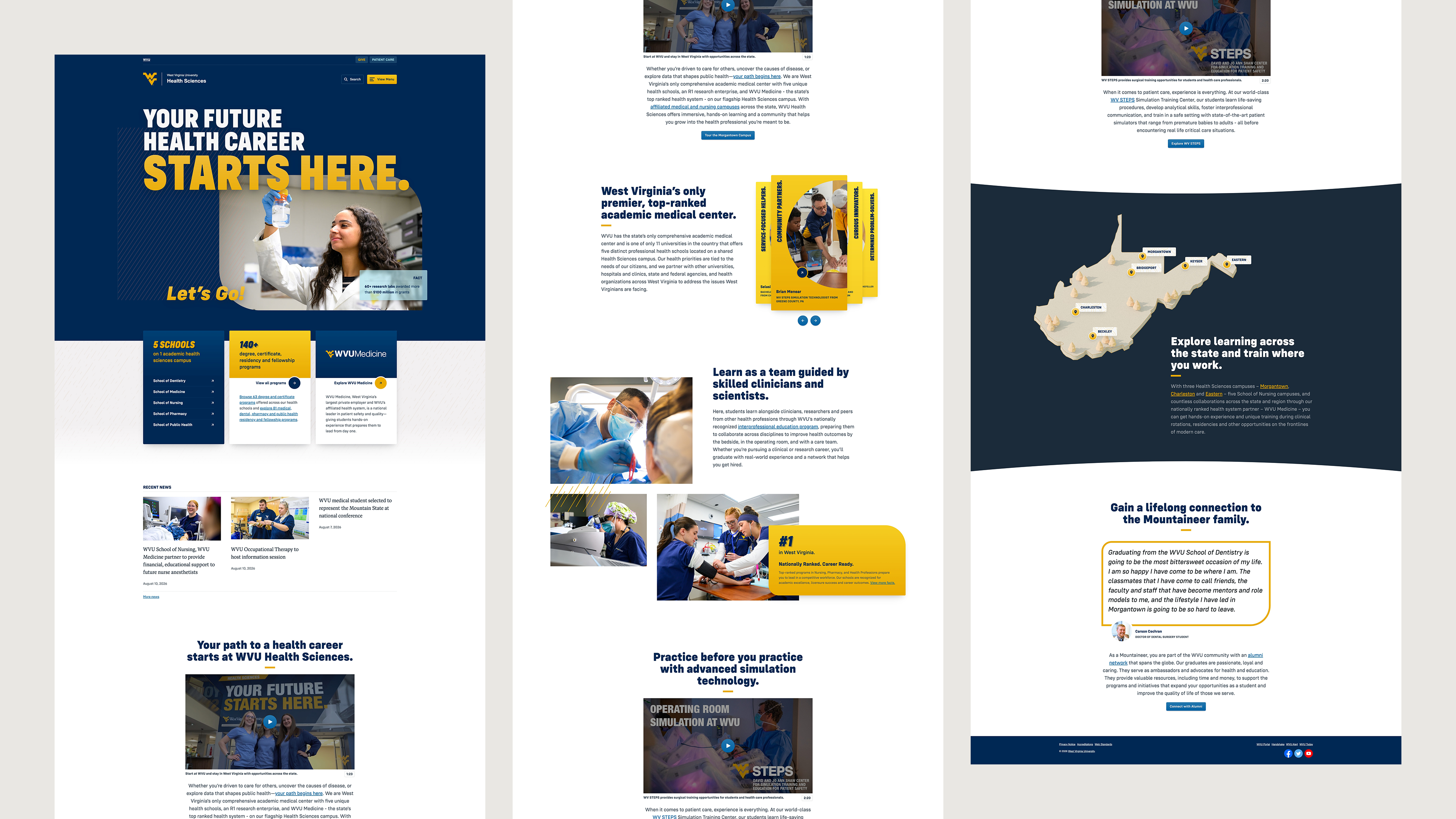
The WVU Health design system is built on strong core design principles and a scalable foundation that supports consistency, accessibility and long-term growth.
By unifying layouts, styles and behaviors across websites, the system reduces redundancy while ensuring alignment with WVU brand patterns, and adherence to accessibility standards.
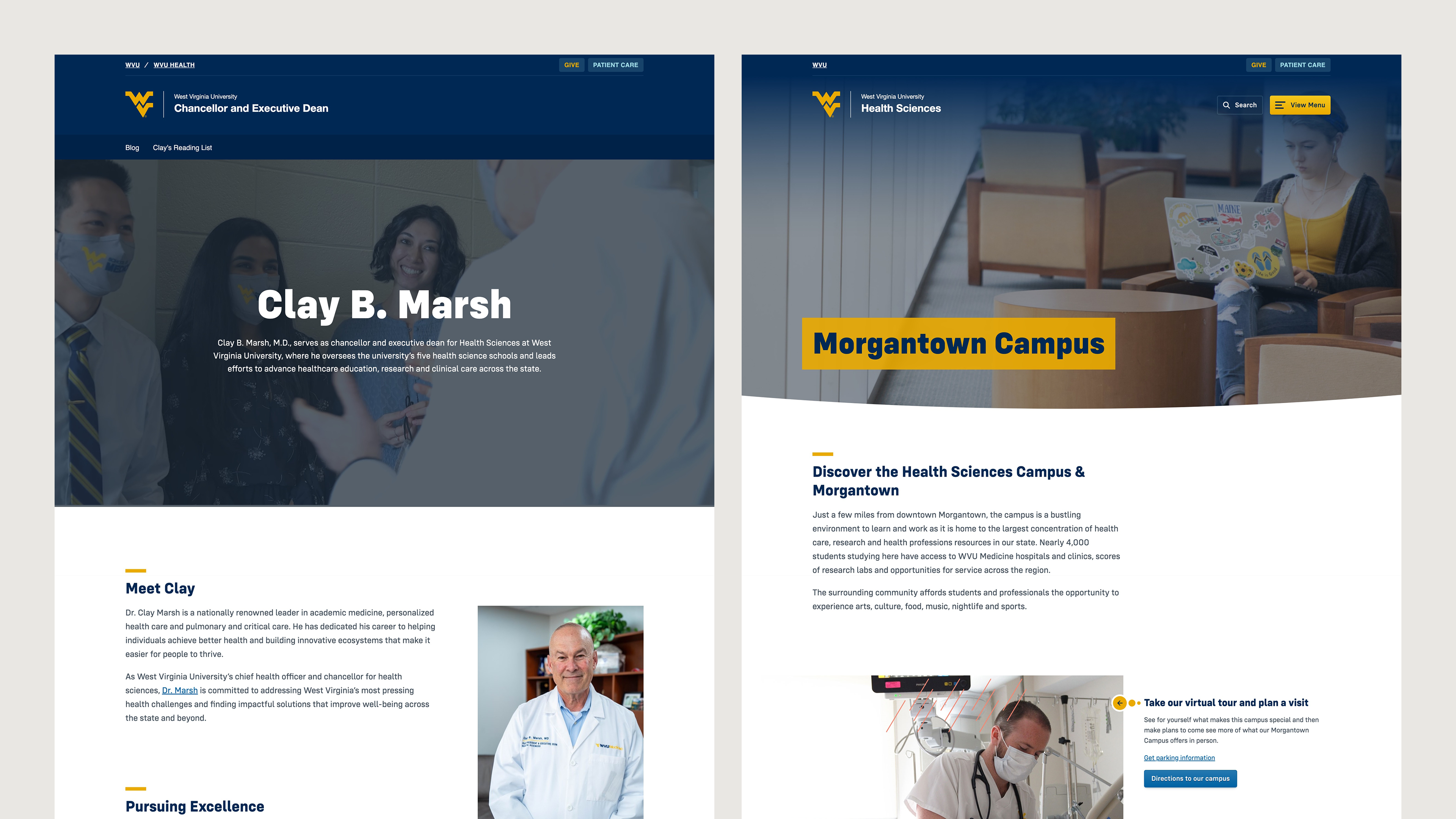
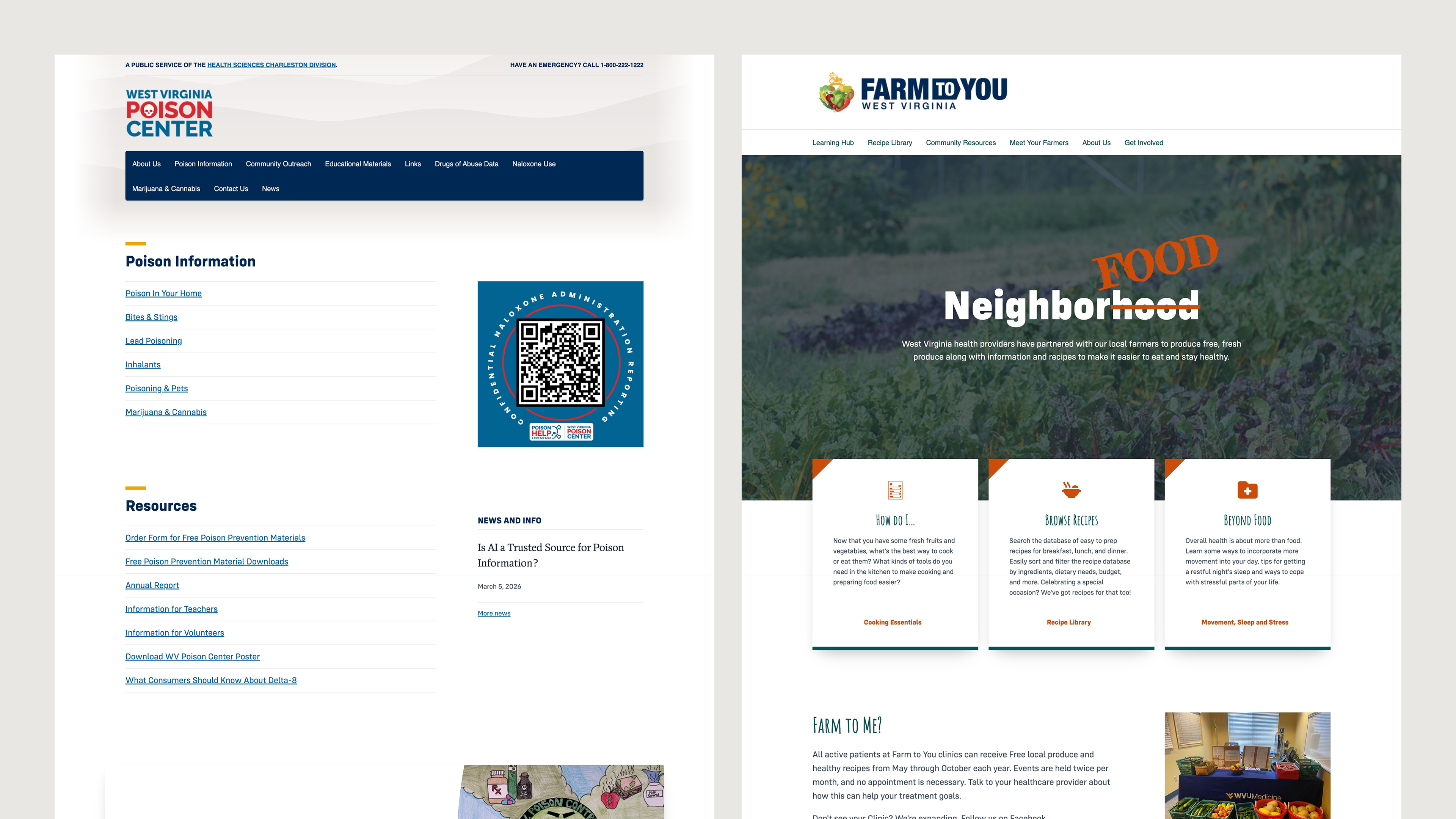
The framework prioritizes consistency without rigid uniformity, balancing clear standards with design flexibility. Components share core principles and patterns rather than identical appearances—allowing each website to carry its own visual character without drifting from the system.
A Predictable Foundation
The system uses a modified ITCSS architecture with BEM methodology, leveraging native cascade layers to manage specificity and prevent conflicts.
- Sass handles logic-driven tasks, including managing nesting, defining variables for block-level classes, creating mixins, performing calculations, and handling iterations.
- Thoughtfully-structured HTML hierarchy is paired with purpose-driven class selectors, avoiding element selectors and utility classes to keep styles consistent, reusable, and maintainable.
- Extra levels of HTML with distinct, non-competing classes are encouraged to clarify structure rather than stacking multiple responsibilities onto a single element.
- In Sass, nesting depth is limited to two levels to keep styles readable, maintainable, and prevent over-specificity.
- CSS variables drive all configurable properties and design tokens, including colors, fonts and decorative values. Components define their own default variable values locally rather than globally at the root.
- Simple grids, such as halves, thirds, and fourths, promote predictable, reusable structures.
Design System CSS
In the core design system stylesheet, imports are organized by responsibility and specificity into native cascade layers to create a predictable hierarchy.
// Define the order of cascade layers
@layer generic, base, objects, components;


// Settings
settings.variables.wvu-colors
settings.variables.wvu-fonts
...

// Tools
tools.layout
tools.visually-hidden
...

@layer generic {
  generic.normalize
  ...
}

@layer base {
  base.root
  base.typography
  ...
}

@layer objects {
  objects.layout
  objects.buttons
  ...
}

@layer components {
  components.wvu-masthead
  components.wvu-footer
  components.media-block
  ...
}
Theme CSS
Individual themes extend that same structure through a separate stylesheet, overriding or adding styles within the appropriate cascade layer.
@layer base {
  base.root
  ...
}

@layer objects {
  objects.buttons
  ...
}

@layer components {
  components.media-block
  ...

  // Theme-specific imports
  components.hero
  ...
}
Intention Before Implementation
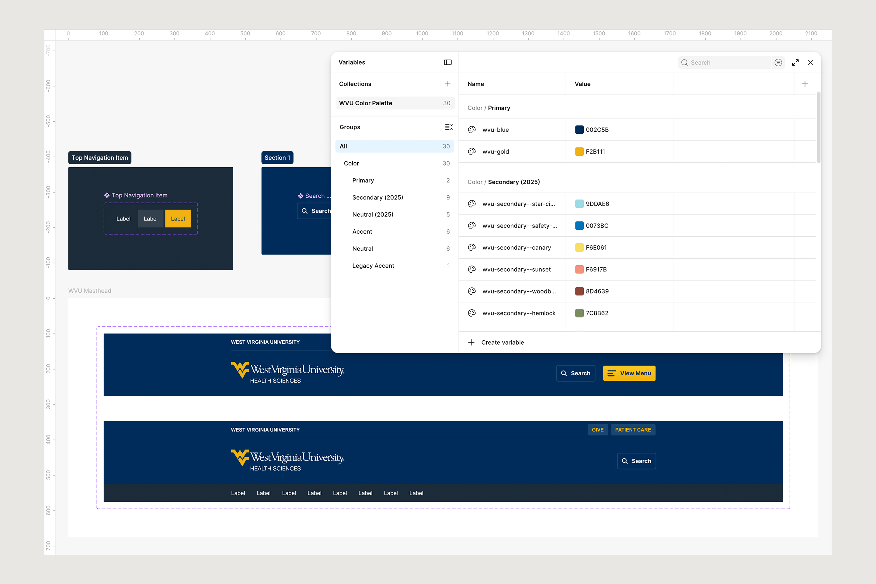
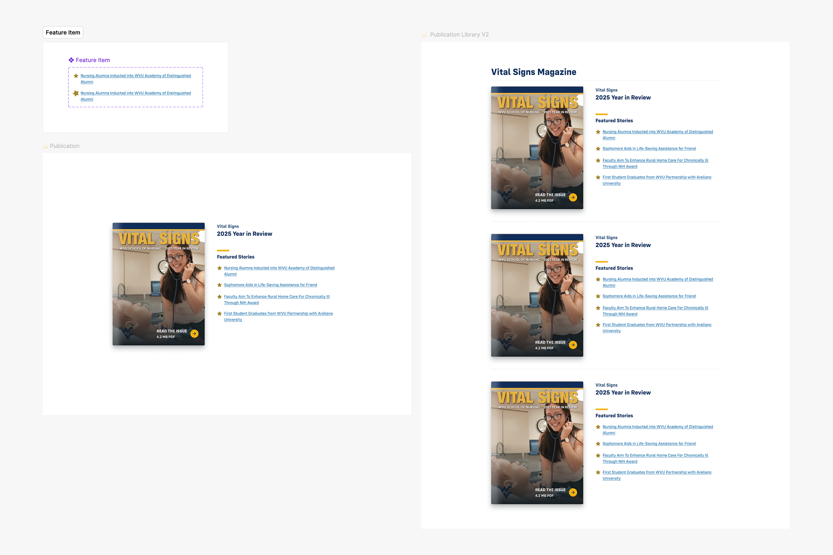
Every component and layout begins in Figma before a line of code is written. This ensures a deliberate exploration step rather than designing directly in the browser, keeping decisions intentional and reviewable.
Design tokens are defined in CSS and reflected in Figma, creating a shared vocabulary between design and development. WVU brand tokens establish the core color and type values, with a set of Health Sciences-specific variables layered on top for system-level defaults like link color, border treatments, and component shadows.
Deeper integration between the Figma library and the coded system is an active area of development as the system matures.
Organized for Scale
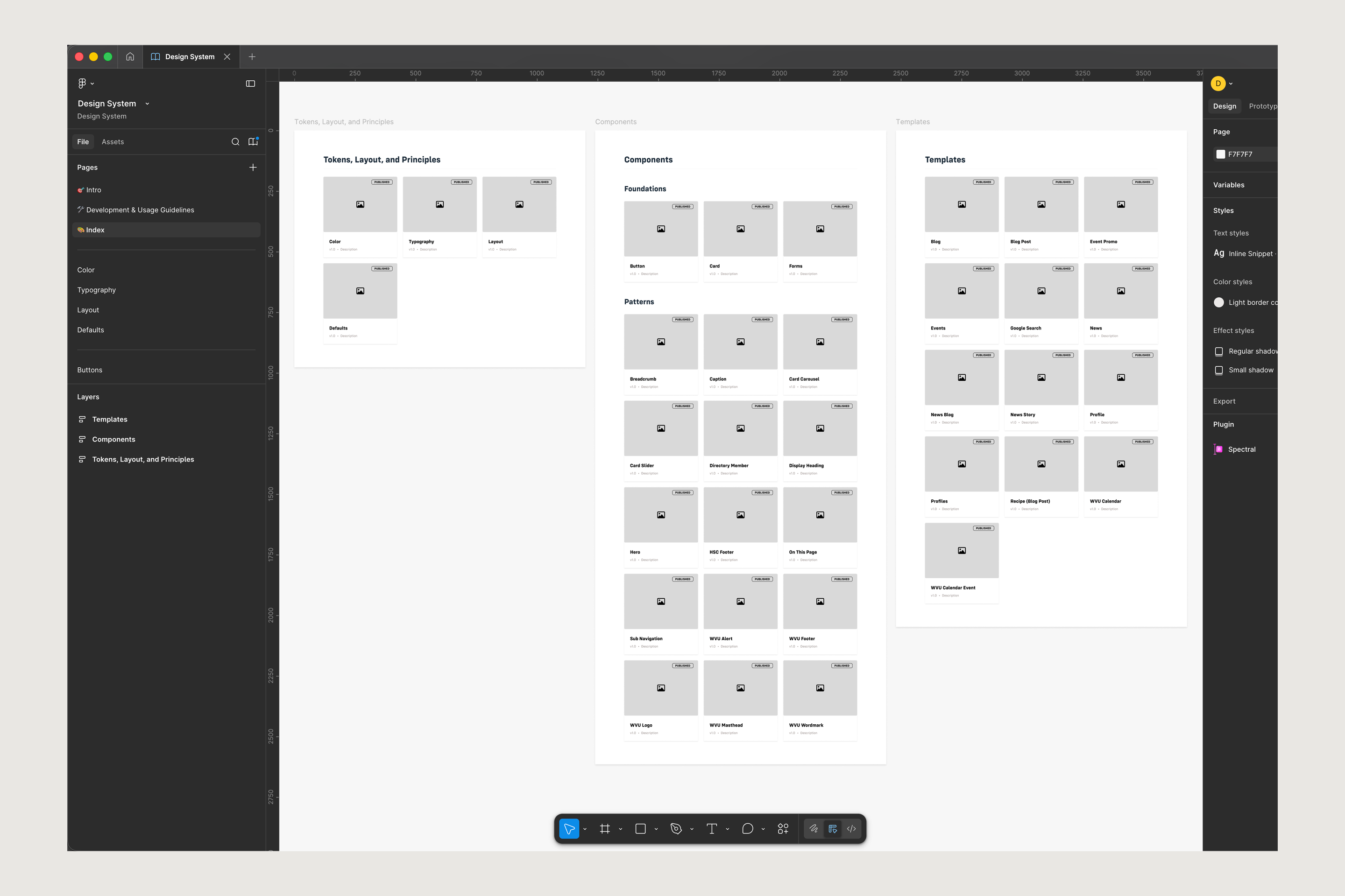
The system is organized into four layers: tokens and layout helpers that establish the core visual language, foundational components like buttons, cards, and forms that everything else builds on, a growing library of patterns that compose those foundations into more complex UI, and full page templates that define how it all comes together.
What It Made Possible
The system launched driving the primary WVU Health website and 30+ sub-sites within 3-4 months. Because every site shares the same components and layouts, accessibility improvements propagate everywhere. Sub-sites requiring a distinct visual identity layer on a minimal supplemental stylesheet. The core remains untouched.
The result is a cohesive web presence that stakeholders have responded to well, with consistent typography, layout, and interaction patterns across every site in the network.